Designing for the Moment Before the Click

Good UX begins before a user clicks anything.
When I first started designing interfaces, I paid most of my attention to what happened after an interaction: the new screen, the confirmation message, or the completed animation. Over time, I realise that the moments before a click matter just as much.
A person needs to understand what they are looking at, what they can do, and what might happen next. If the interface makes them pause for the wrong reason, the experience is already creating friction.
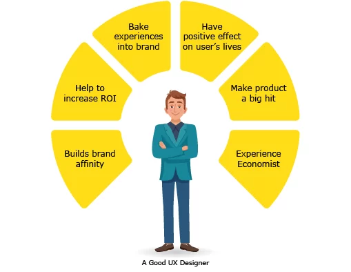
Embed: yujdesigns.com/wp-content/uploads/2019/05/Good-UX-Designer.png
Clarity is a form of guidance
I try to design each screen like a quiet conversation. Hierarchy tells the user where to look first. Labels remove uncertainty. Spacing gives important elements room to breathe. Feedback confirms that the interface has noticed an action.
These details may seem small, but together they build confidence. A clear button is not only visually attractive it makes a promise about what will happen when it is pressed.
Designing around real behavior
Users rarely explore a product in the perfect order shown in a presentation. They scan, hesitate, return to previous screens, make mistakes, and sometimes leave halfway through a task.
That is why I ask practical questions while designing:
Can someone understand this screen in a few seconds?
Is the next action visible without being aggressive?
What happens when the user makes an error?
Does the interface still make sense without an explanation from the designer?
These questions help me move beyond decorating screens and start shaping an experience.
The invisible part of good design
Some of the strongest UX decisions are the ones users never consciously notice. A clear structure, familiar pattern, or well-timed response simply allows them to continue without interruption.
For me, that is the goal: not to make every element demand attention, but to make every interaction feel considered.
date published
Jun 3, 2026
reading time
4 min