myrapid pulse
Malaysia’s primary public transit redesign - focused on clearer navigation, and a user-centric interface.
00

problem
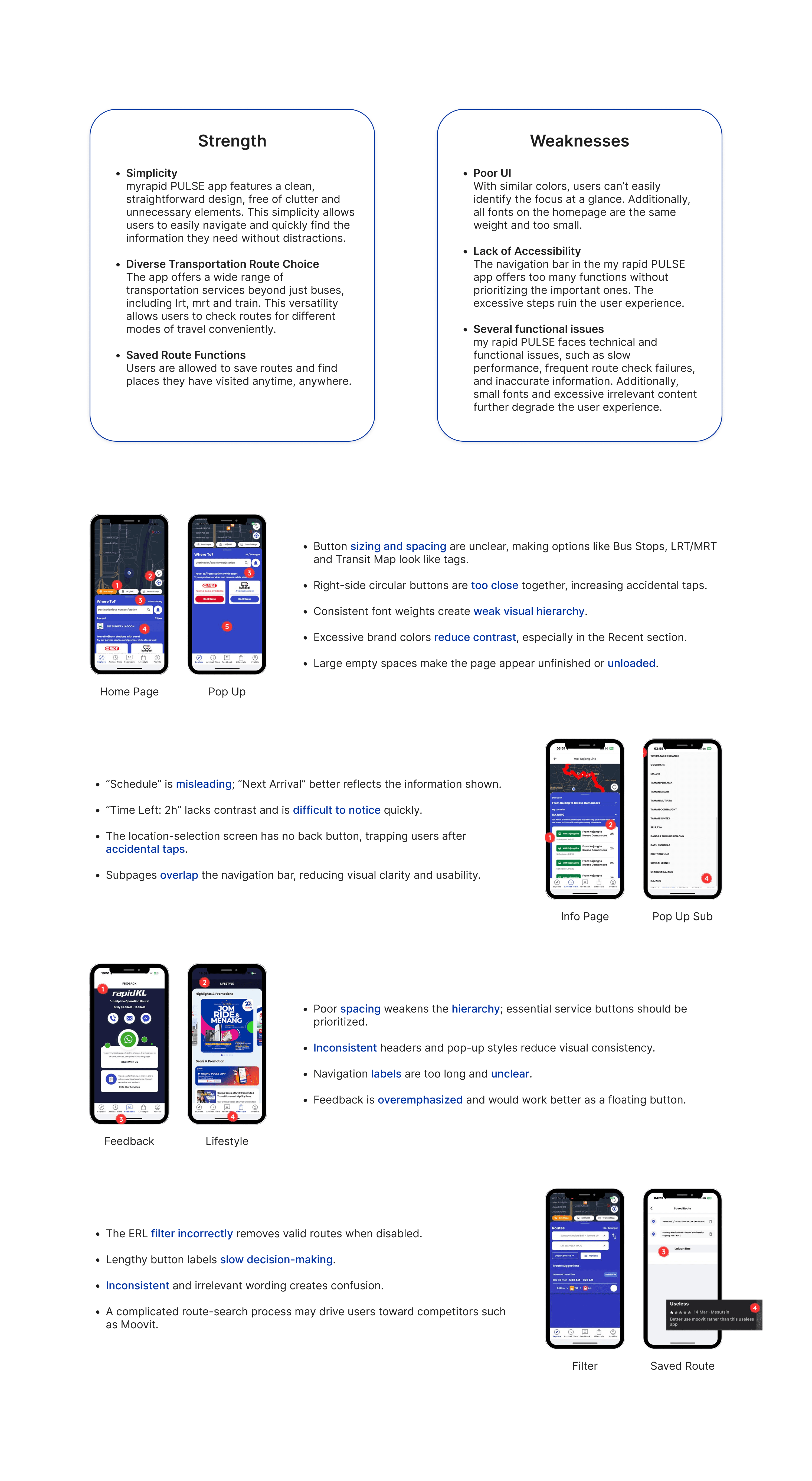
MyRapid PULSE suffers functional bugs, unintuitive workflows and inconsistent UI design. Its broken route filter malfunctions when toggled, while an overly complex search experience drives users to competitor Moovit. Unmarked travel time indicators, confusing navigation, ambiguous buttons and messy typography further reduce usability, alongside uneven layout styling across pages.
solution
Fix the route filter via user testing, streamline search flow and add personalized routes to boost competitiveness. Highlight travel time, improve buttons and navigation, simplify text, refine layout styling, and unify the app design for better usability.
Clarify · Research · Architect · Fine-tune · Transition
Purpose of proposal
To identify usability issues in the PULSE app through user feedback and competitor analysis, then recommend improvements that simplify navigation, optimize user flows and increase user satisfaction and trust.

I systematically categorized every identified issue from technical failures, search-process friction, general user experience flaws to inconsistent UI design rules. After documenting all problems clearly, I formulated targeted, actionable fixes for each pain point. My solution roadmap addresses broken filter functionality, streamlines route searching, clarifies visual information hierarchy, reorganizes navigation and button design, refines color and typography usage, and standardizes styling across the whole application.
The end goal of this redesign initiative is to create a more intuitive, reliable, and user-centric transit app that resolves existing frustrations, improves overall usability, and helps it retain users amid competitive alternatives.
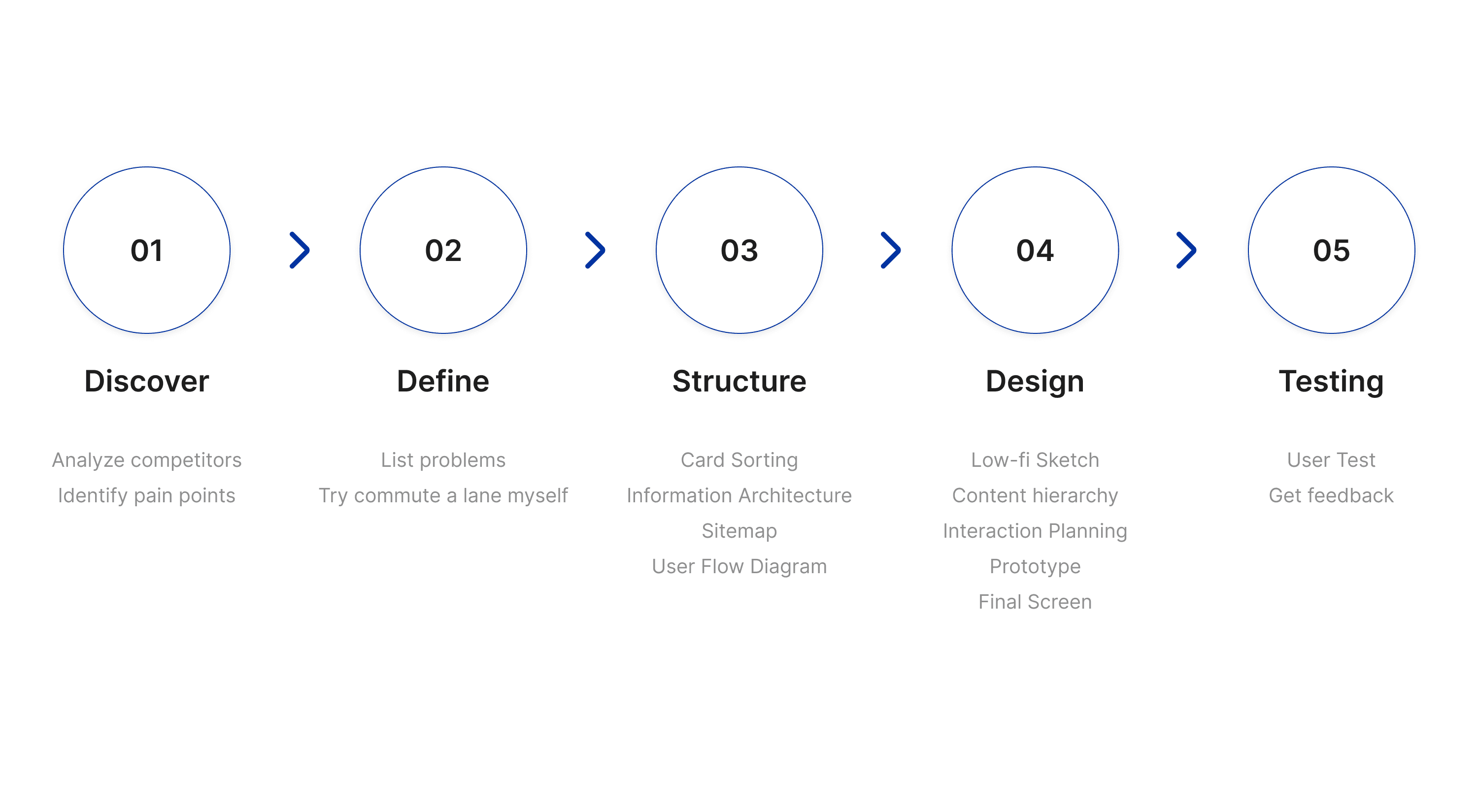
Design Process
Target Audience
The target audience includes people aged 18–45 of all genders, particularly students, working professionals and blue-collar workers who use Rapid KL, Rapid Penang or Rapid Kuantan and rely on Android or iOS smartphones for public transport navigation and ticketing.
Competitive Analysis
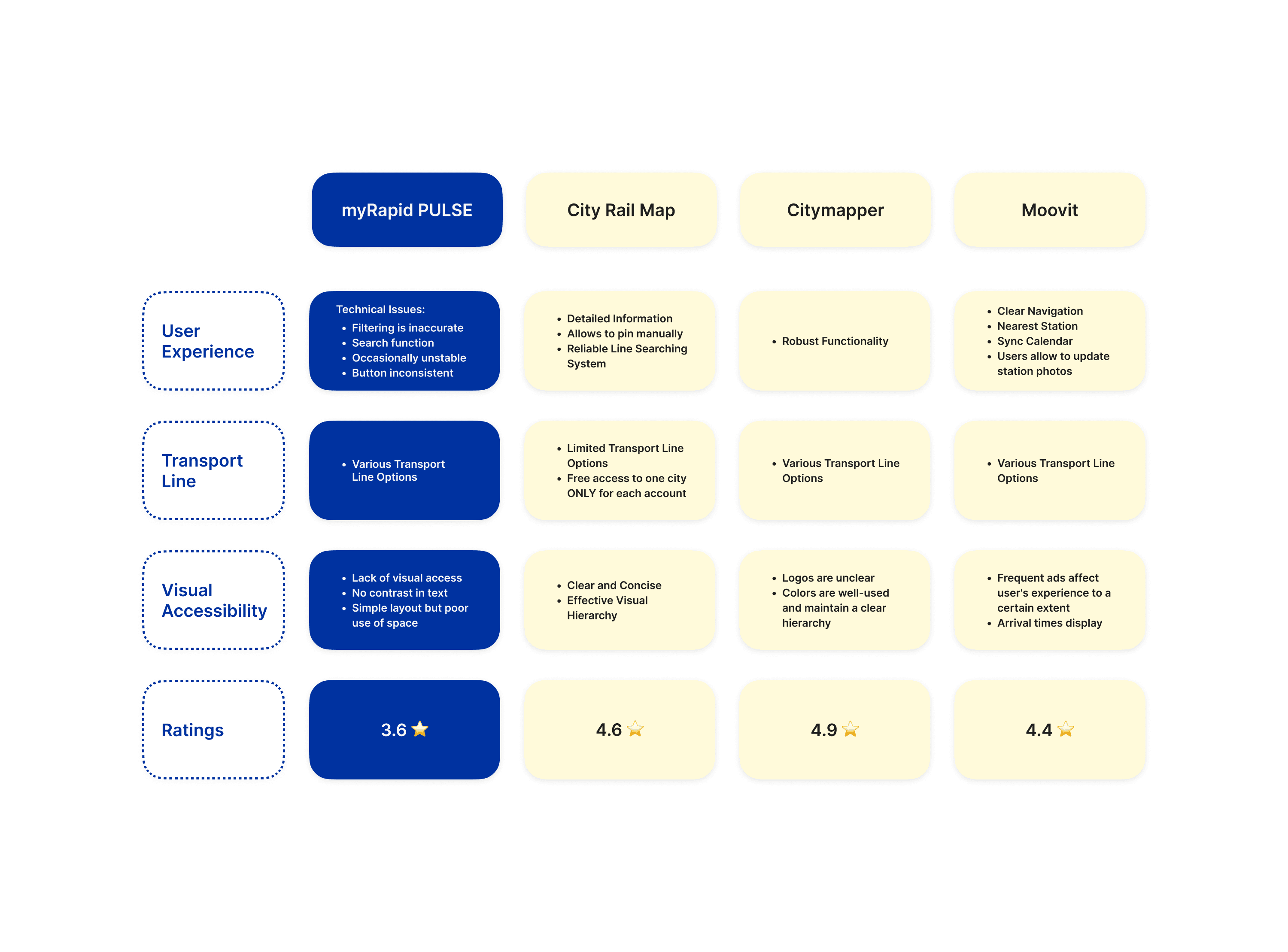
Analysis Document
Redesign Objectives
Improve Readability & Accessibility - Improve the readability and accessibility of key sections, like live tracking, by implementing clearer layouts, distinct visual elements, and better organization of information.
Enhance User Experience - Enhance the overall user experience by resolving navigation issues and usability concerns identified by users.
Enhance User Optimize Visual Hierarchy - Create a visually engaging design that clearly conveys key information, boosts user engagement, and improves overall app usability.

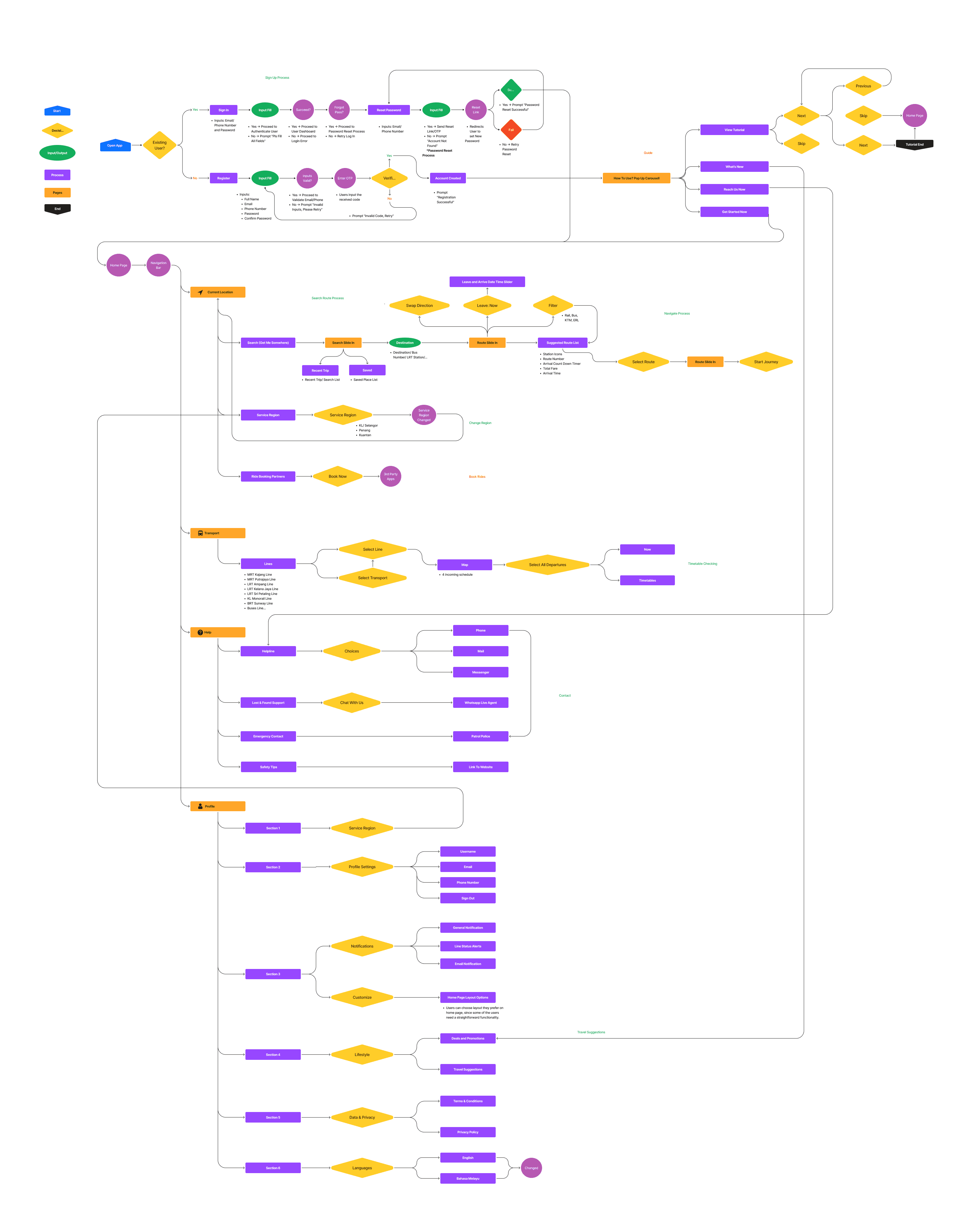
User Flow Diagram
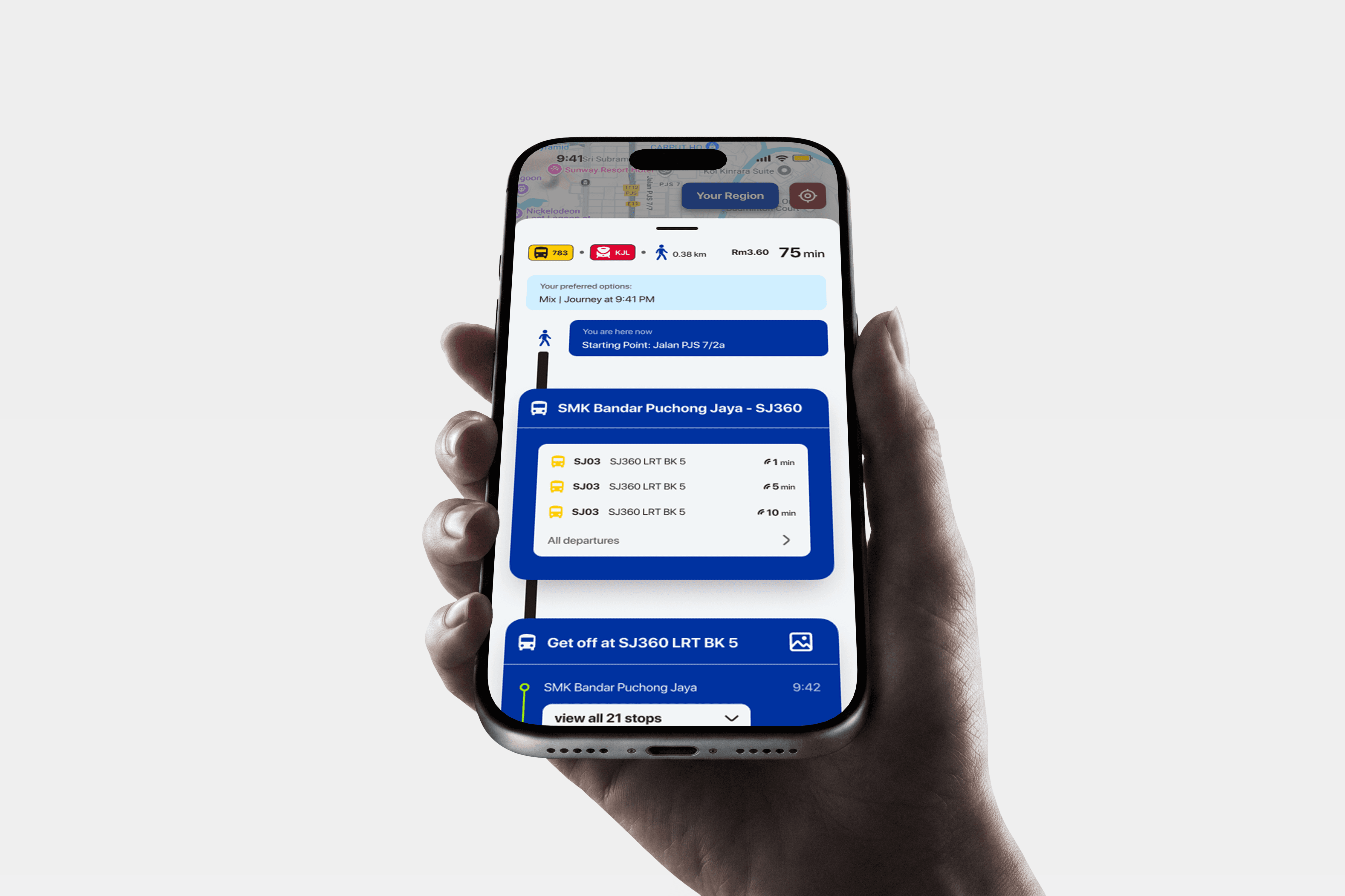
Let's see what has changed
Live Prototype
year
2025
timeframe
3 month
tools
Figma
category
UI/UX
01
02

03

04

see also